
Plot/Chart for large input file
How to generate a chart, if you have a huge data set?
A few days ago, I was faced with a task. I had to generate a scatter plot of a huge file. This text file contains ~ 42 million data points.
Try #1: highcharts
So I started to search for a visualizer library that can handle this large data set. My first choice was highcharts. It is written in JavaScript. To execute this on my computer I configured a local web server. It started pretty well. But after a wile, a message from Firefox was shown: "A script on this page may be busy, or it may have stopped responding. You can stop the script now, or you can continue to see if the script will complete." I just had to press continue.
A few minutes later, my laptop started to slow down dramatically. I even couldn't move the cursor smoothly. And finally, the OS froze. This library probably can't handle this amount of data.
Try #2: jfreechart
JavaScript is probably not the best programming language for this scatter plot. I switched to Java, trusting that I will have a better result.
jfreechart was my choice. Easy to implement and it has a nice interface. At this point, I had the possibility to use a server for this computation. The system has 64 Gb RAM and a 4 Core CPU Processor. I generated a jar file and started the program on the evening (also increased JVM Heap size).
Next day: Process was still running.
Finally, Try #3: matplotlib (pyplot)
Python is known as a solid machine learning- and big data programming language. That's why I used a python library called matplotlib (pyplot). A scatter plot for this large text file (~ 42 million data points) was generated in under 12 minutes!
This library can either display a GUI with a diagram or save a png file on your disk.
To help you implement this as well, I want to share my code:
#!/usr/bin/env python
import os
import pandas as pd
import matplotlib

matplotlib.use('Agg')
from matplotlib import pyplot as plt
from os.path import basename

filename = './input.txt'

data = pd.read_csv(
    filename,
    header=None,
    sep=' ',
    usecols=[0, 1],
    names=['ROW0', 'ROW1']
)

plt.scatter(data['ROW0'], data['ROW1'], linewidths=7, color='r')

# plt.title('title')
# plt.xlabel('x')
# plt.ylabel('y')
plt.grid(True)

# input.txt -> FileFormat: X Y
filename = os.path.splitext(basename(filename))[0]

fig = plt.gcf()
fig.set_size_inches(18.5, 10.5)
fig.savefig(filename + ".png", dpi=300)
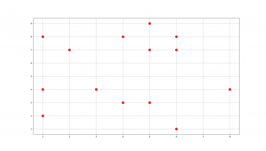
The input.txt looks like this:
1 8
5 9
6 8
2 7
4 3
6 7
4 8
6 1
5 3
8 4
1 2
1 4
3 4
5 7
The generated image:
plt.scatter is just one example to generate a plot. There are a few more types to use: https://matplotlib.org/users/pyplot_tutorial.html
This given python script is a basic implementation to generate a scatter plot for a large file. It also can be used to generate a various type of charts.
Note: If you have a weak computer, you should use a (powerful) server to execute this script. It's hard to keep the OS running during the execution on a system with low memory.
Tested on:
- OS: CentOS 7
- Python: 3.6.1
- Pandas: 0.20.2
- Matplotlib: 2.0.2
Credits:
- Post photo by Jason Coudriet on Unsplash